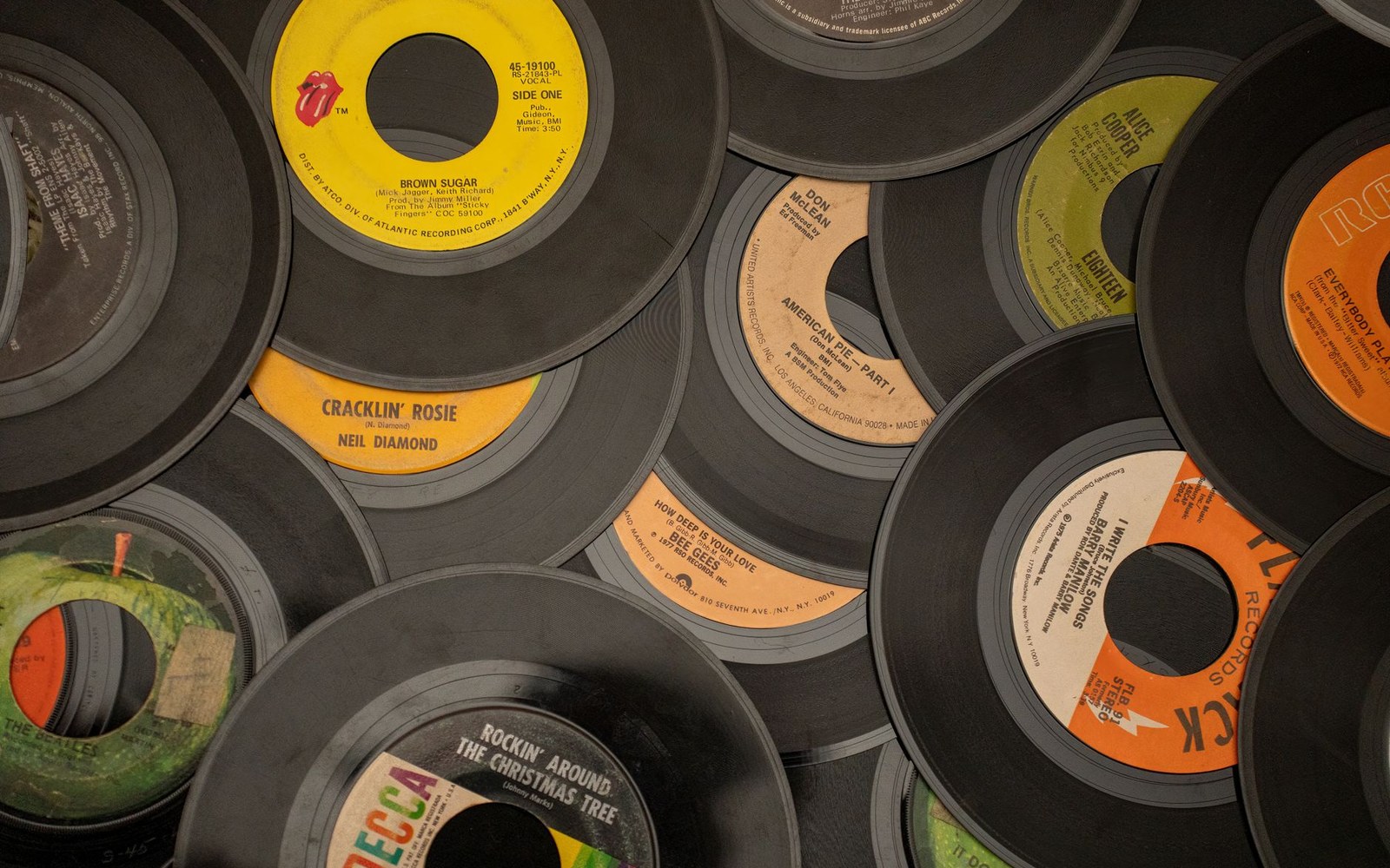
The circle is three and a half inches across and has to carry a company, a catalogue number, a writer and a publisher.
Photo: Tom Fisk / Pexels
Record labels: the rooms, the people, the catalogues.
The 45 rpm single's centre label was a few inches of paper, but every major American label treated it as a design brief.
The circle is three and a half inches across and has to carry a company, a catalogue number, a writer and a publisher.
Photo: Tom Fisk / Pexels
RCA Victor introduced the 45 rpm format in 1949, and with it came an immediate visual problem: how do you identify a record whose playing surface is mostly hole? The answer was the centre label — a paper disc glued to the vinyl that carried not just catalogue number and title but colour, typeface and genre logic that a buyer could read across a record-shop counter at a glance.
Sun Records in Memphis solved it with orange and yellow, a sunrise gradient that made 706 Union Avenue, Memphis look warmer than it probably was in January. Elvis Presley's "That's All Right" (Sun 209, 1954) wore that label before most people understood what they were holding. The font was plain, the credits tight, the colour doing all the emotional work.
Chess Records in Chicago went the opposite direction: stark black-and-white chessboard squares framing the title, a design that signalled seriousness and urban grit without spending much on either. Muddy Waters, Chuck Berry — the catalogue marched through that grid for years, the board pattern functioning as a cartouche before anyone at 2120 South Michigan Avenue, Chicago used that word.
Atlantic's early 45s ran a black label with silver text, shifting through several variants before the red-and-black label became the house identity in the 1960s — functional, legible, associated by then with enough hits that the design carried authority it hadn't earned on its own terms. Stax used a yellow label with a pointing hand and a stack of records as its logo, later simplified, the whole thing radiating a rough-and-ready energy that matched what Jim Stewart and Estelle Axton were recording in their converted cinema on McLemore Avenue.
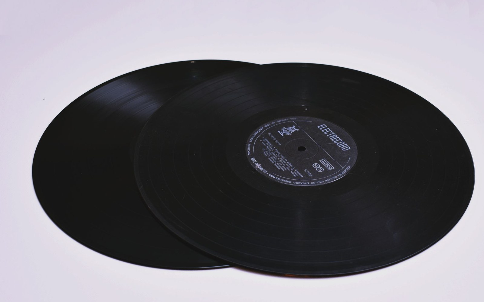
Sun 209, July 1954.
Photo: Diana ✨ / Pexels
Motown's Tamla label opened with a globe, later replaced by the spinning-record motif and the unmistakable tagline "The Sound of Young America" — a piece of copy that functioned simultaneously as marketing claim and design element. Berry Gordy understood that West Grand Boulevard, Detroit was selling an idea of modernity, and the label art had to say so in the half-second a customer spent deciding.
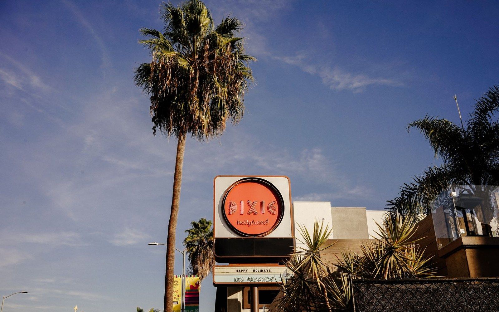
The sign went up on a house, not a building: Gordy ran Hitsville as premises and payroll at once.
Photo: Darya Sannikova / Pexels
Sun 209, July 1954.
Photo: Diana ✨ / Pexels
What all five shared was the understanding that the 45's label wasn't packaging — it was the primary visual identity of the release. At a time when album sleeves were still developing their own grammar, the two-inch paper disc was where American label design actually lived, pressed into the vinyl at the factory and spinning under the stylus at a speed of forty-five revolutions per minute.