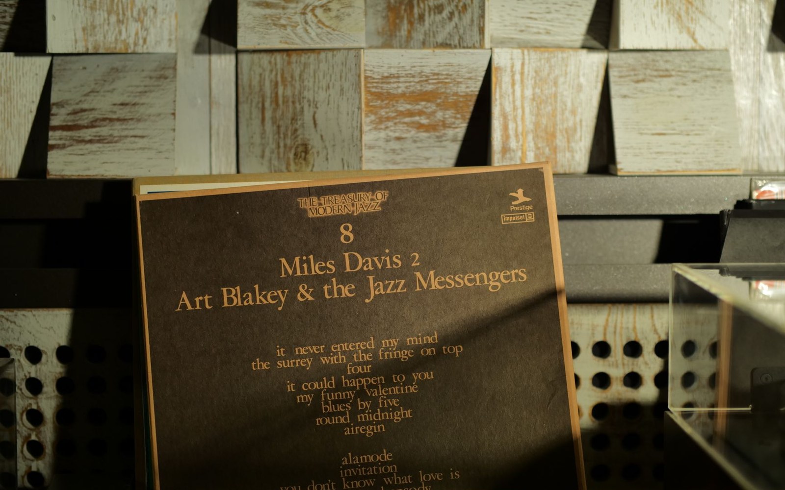
Roughly five hundred sleeves in eleven years, built from session photographs, two colours and type set very large.
Photo: Nikita Korchagin / Pexels
Record labels: the rooms, the people, the catalogues.
How a graphic designer working from contact sheets and a tight budget built the most recognisable visual language in jazz — and possibly in recorded music.
Roughly five hundred sleeves in eleven years, built from session photographs, two colours and type set very large.
Photo: Nikita Korchagin / Pexels
Reid Miles came to Blue Note in 1956 with an eye trained in magazine design, having worked at Esquire. What he found at the label's operation — then run by Alfred Lion with photography handled almost entirely by Francis Wolff — was a stockpile of session photographs taken in Van Gelder's studio in Hackensack, New Jersey: candid, close, lit by available tungsten light and Wolff's single flash. Miles treated these not as illustrations for a sleeve but as raw material to be cut, cropped, tilted and printed against flat colour fields.
His first consistent move was the severe crop. Where conventional album art of the period showed musicians in full or three-quarter view, Miles would take Wolff's contact sheet, find the sharpest frame, and slice it to a detail — an eye, a horn bell against a cheekbone, hands on a keyboard floating in negative space. Francis Wolff's photographs were made with this in mind; he and Miles worked in a genuine collaboration, Wolff understanding that the frame he shot would not survive intact.
The typography was as deliberate as the cropping. Miles built most sleeves around Futura — the geometric sans-serif cut by Paul Renner in 1927 — sometimes pairing it with Franklin Gothic for a secondary weight. Both faces were set large, sometimes at a scale that dominated the cover, the musician's name or the album title treated as a design element rather than a caption. Letterspacing was pushed wide on some covers, compressed on others; baselines were stacked at unconventional intervals. The effect was closer to Swiss International Style poster work than to anything else appearing on a jazz record in 1957.
The sign went up on a house, not a building: Gordy ran Hitsville as premises and payroll at once.
Photo: Darya Sannikova / Pexels
The sequence of covers Miles produced across the label's classic decade makes the system legible. Hank Mobley (Blue Note BLP 1568, 1957) used a Wolff portrait cropped to the face, the name in block caps running vertically along the right margin. Sonny Clark Trio (BLP 1579, 1957) placed the pianist's name in enormous Futura against a near-black ground, the photograph reduced to a small, warm-toned inset. By the time Miles reached Jackie McLean: Let Freedom Ring (BLP 4106, 1962), the conventions had matured: high-contrast duotone printing rendered Wolff's photograph in two flat inks, blue and black, giving the image a graphic intensity that straight four-colour reproduction would have softened.
The duotone process was partly a budget solution — two-colour printing cost less than four — but Miles exploited the constraint so effectively that the limitation became the signature. Colour choices were deliberate: the label's blue appeared consistently, often paired with a warm orange or a mustard yellow that made the sleeve legible as Blue Note at a distance, before the listener had read a word.
Not every cover was typographically dominant. Idle Moments by Grant Green (BLP 4154, 1963) let Wolff's photograph breathe across most of the sleeve, with type reduced to a secondary role. Miles knew when to suppress the system; the mark of a mature visual language is knowing which conventions to break. What remained constant through all the variation was a quality of graphic intention — nothing accidental, nothing decorative for its own sake.
Miles designed the majority of Blue Note's covers through to 1967, when his relationship with the label wound down as the music itself shifted. The body of work runs to well over five hundred covers. It has been widely studied as a unified programme rather than a collection of individual commissions — an achievement unusual enough in sleeve design to draw comparison with corporate identity work, albeit made one 12-inch sleeve at a time, often against weekly deadlines with a budget that did not allow for photographic retouching.
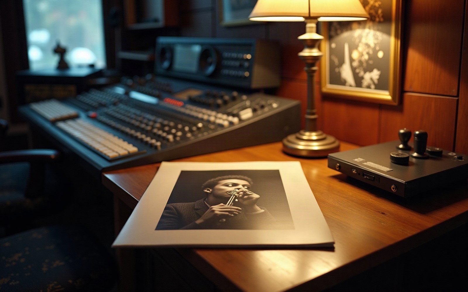
An LP sleeve under a lamp. The cover was the only part of a record a buyer could examine before paying for it.
The legacy is visible in subsequent independent label design — in Peter Saville's work for Factory Records, which shares the typographic ambition if not the palette — and in the continuing reissue market, where the original Miles sleeves are reproduced because replacing them has never been seriously considered.