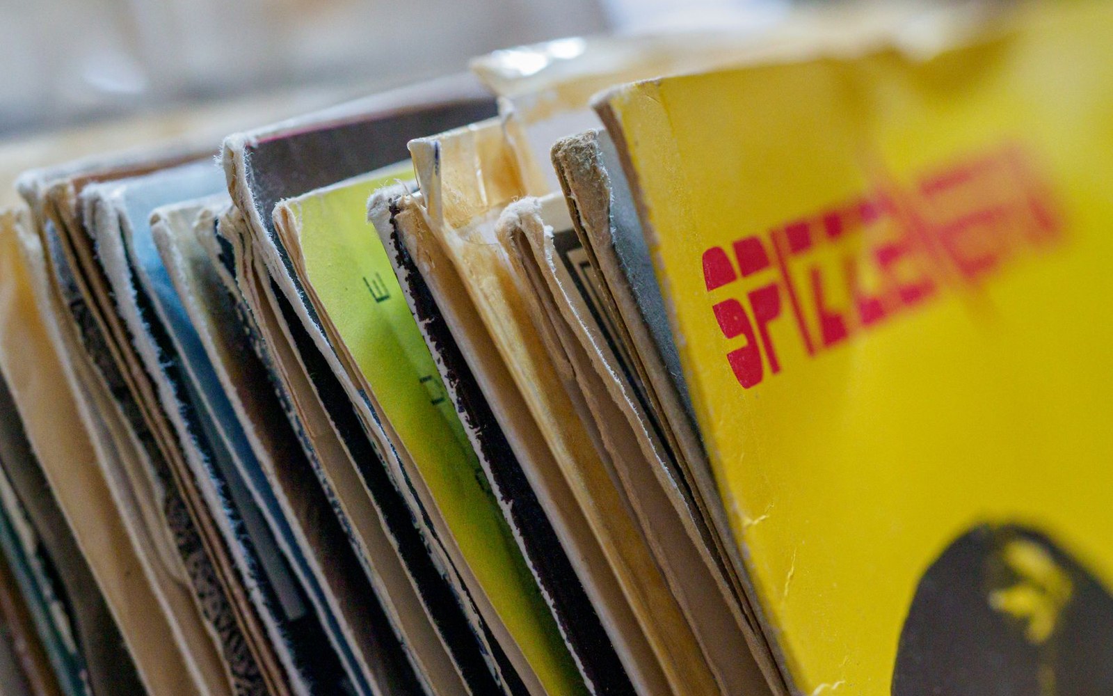
4AD had no genre, so Oliver gave it a grammar instead.
Photo: Brett Jordan / Pexels
Record labels: the rooms, the people, the catalogues.
Design at 4AD was not illustration of music — it was a parallel sensibility, made from the same impulses.
4AD had no genre, so Oliver gave it a grammar instead.
Photo: Brett Jordan / Pexels
Vaughan Oliver began designing for 4AD — actually, for Ivo Watts-Russell's Kensington Park Road label — in 1982, working under the studio name v23. His collaborator from 1983 was photographer Nigel Grierson, together trading as 23 Envelope. The practical tools were unglamorous: photocopiers pushed to deliberate distortion, photograms made by laying objects directly onto light-sensitive paper, Letraset rubbed onto textured surfaces, and found imagery stressed until it abstracted. Type was treated as texture rather than information — set at angles, reversed out, buried under layers of translucent print.
The result was a coherent aesthetic that owed nothing to the grid-and-Helvetica rationalism of the music industry mainstream and nothing, equally, to punk's ransom-note aggression. Oliver's covers occupied a space that felt biological and decayed simultaneously: skins, flowers, x-rays, water damage, the grain of photographic emulsion pushed past legibility. Gatefold sleeves and elaborate inner bags extended the visual argument across more surface area. Catalogue numbers appeared, but the design never prioritised them.
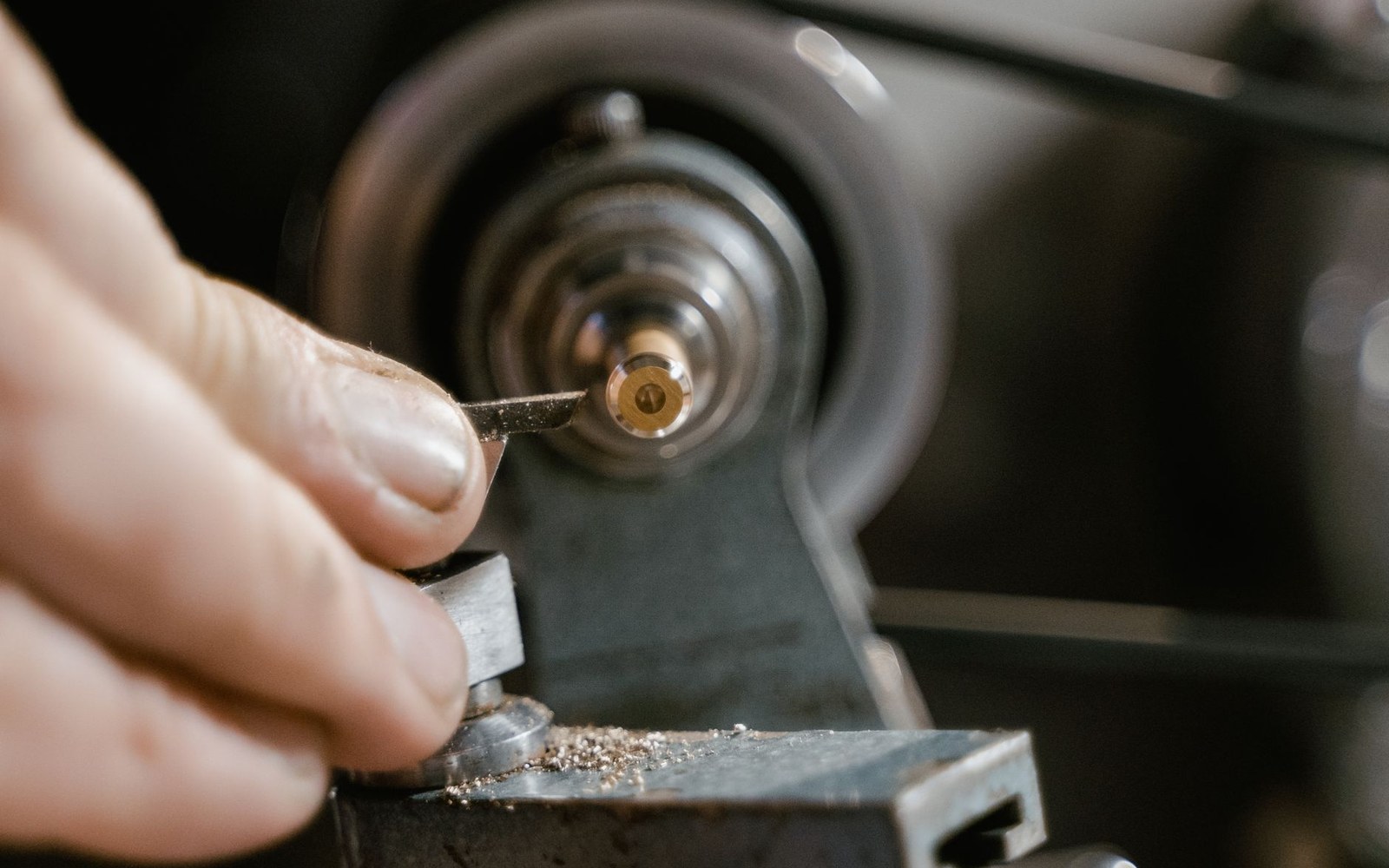
Between the tape and the shop there are four more trades: mastering, plating, pressing and printing. A label that could not book all four had no product at all.
Photo: Tima Miroshnichenko / Pexels
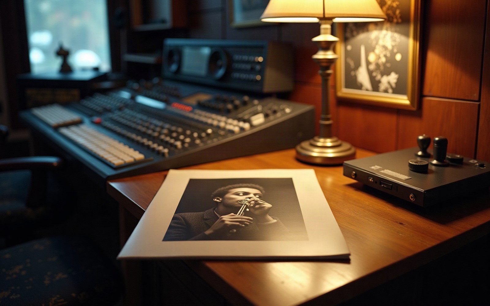
An LP sleeve under a lamp. The cover was the only part of a record a buyer could examine before paying for it.
4AD in these years signed This Mortal Coil, the Cocteau Twins, Dead Can Dance, Bauhaus, Pixies, and Throwing Muses — acts with almost nothing stylistically in common. Oliver's design was the label's unifying claim: whatever genre these artists occupied, they belonged to the same sensibility. The Pixies' Surfer Rosa (1988) and the Cocteau Twins' Treasure (1984) share no musical DNA, but on a record-shop shelf they announced the same affiliation.
That coherence had real commercial logic. Without a genre to sell through, 4AD sold an aesthetic, and Oliver's studio was the mechanism. His work for the label is now held as a reference point in graphic design history precisely because it solved a business problem — roster incoherence — through visual means, and did so without ever looking like a solution to anything.